Choose the Right Symbols: Make Visuals Clear and Effective
Published {$created} by Carsten Blum
At the heart of every visual schedule or support tool lies one simple idea: The symbol must communicate the meaning instantly.
If a child, teen, or adult misinterprets a symbol, the entire routine breaks down. That’s why choosing the right type of visual, photo, drawing, or icon, is one of the most important parts of building effective visual support.
Clear symbols reduce confusion, increase independence, and create predictable, calm routines across home, school, therapy, and institutional settings.
Types of Symbols: What to Use and When
Not all visuals work equally well for all users. Here are the most common categories, and when to choose each.
🖼️ Photographs
Real-life images of objects, places, or actions.
Best for:
Young children
Individuals with limited abstract thinking
People who rely heavily on concrete visual cues
Transitional phases (e.g., moving from PECS to illustrated icons)
Pros: Highly recognizable, minimal interpretation neededCons: Less flexible, harder to standardize, busy backgrounds can be distracting
🎨 Simple drawings or sketches
Cartoon-like representations of actions, objects, or routines.
Best for:
Users who can generalize concepts
Routines that require a softer or child-friendly look
Activities where a photograph is too literal or distracting
Pros: Clear, friendly, customizableCons: If style is inconsistent, recognition becomes harder
🔲 Clean digital icons (pictograms)
Minimalistic symbols often used in AAC, schools, or digital planners.
Best for:
Older children, teens, and adults
Situations requiring consistency across teams or environments
Digital systems where scalable clarity matters
Institutions that want universal design
Pros: Easy to standardize, works across cultures, simple to processCons: Too abstract for some users
How to Choose the Right Symbol for Each User
1. Consider cognitive level
Can the user interpret abstraction, or do they need concrete visuals?
2. Look at age and environment
A teenager may respond better to clean, modern icons than cartoon drawings.
3. Match the symbol to the routine
Medical procedures often need more realistic images; chores may not.
4. Prioritize clarity over aesthetics
The symbol doesn’t have to be “pretty”, it has to be understood.
5. Test and observe
If the user consistently misinterprets a symbol, swap it out.
Tips for Making Symbols Easier to Understand
Use consistent styles across a whole schedule
Avoid visual clutter, plain backgrounds, minimal details
Stick to one concept per symbol
Use clear, high-contrast shapes and colors
Keep the meaning obvious, no guessing, no metaphors
Label symbols (optional) for older children or adults
Small clarity improvements can dramatically increase usability.
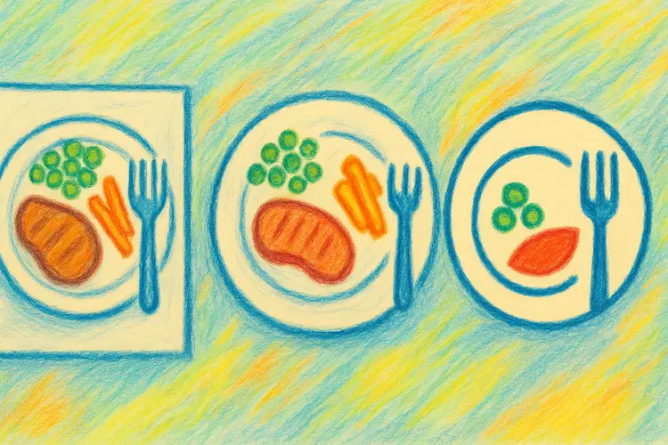
Example: Choosing a Symbol for “Lunchtime”
Symbol type | Example | Best for |
|---|---|---|
Photo | 🖼️ A real plate of food | Early learners or concrete thinkers |
Drawing | 🎨 Cartoon plate and fork | Preschool-aged children |
Icon | 🍽️ Minimalist plate icon | School, workplace, digital plans |
There is no universally “correct” symbol, only the one the user understands best.
When to Change or Update Symbols
Symbol sets may need to evolve as the user grows. Consider updating when:
The user becomes frustrated or confused
They move to school, therapy, or a new environment
They gain abstract understanding
You shift from paper to digital systems
New routines require greater clarity or consistency
Visual support is not static, it grows with the user.
Summary
Choosing the right symbols is one of the foundational steps in creating effective visual support.By matching the visual type to the user’s cognitive level, environment, and needs, you ensure that schedules and routines become clearer, calmer, and easier to follow.
Next step: In the next guide, we’ll explore how to design visual schedules that actually work, including layout, sequencing, and clarity tips.