Visual Support in Public Spaces, Enabling Accessibility
Published {$created} by Carsten Blum
For many people, public spaces, like stations, hospitals, museums, or offices, can be confusing or overwhelming. Unclear signs, unexpected changes, and complex layouts make navigation stressful, especially for individuals with autism, ADHD, or cognitive disabilities.
Visual guidance transforms these spaces into calmer, more predictable environments. It helps people find their way, understand what’s happening, and feel welcome, creating inclusion that everyone can see and feel.
How Visual Support Improves Accessibility
Clear communication: Icons and color codes replace long or confusing text.
Predictability: Visuals show what to expect, where to go, what to do, and what comes next.
Reduced stress: When people can see where they are in a process, anxiety decreases.
Faster orientation: Simple symbols help visitors navigate without asking for help.
Universal design: What supports neurodivergent users benefits everyone.
When a space is visually accessible, it becomes emotionally accessible too.
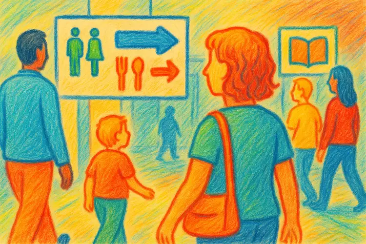
Common Examples of Visual Support in Public Environments
🚉 Transport hubs
Icons showing ticket purchase, waiting areas, restrooms, and exits.Color-coded lines or maps to make routes easier to follow.
🏥 Hospitals and clinics
Visual signs explaining waiting procedures or steps for appointments.Icons for departments and services, reducing confusion in stressful situations.
🏫 Schools and public buildings
Color-coded corridors, pictogram-based room labels, and visual maps for visitors.
🏛️ Museums and libraries
Guides showing where to start, quiet zones, and “next steps” for children or visitors with sensory sensitivities.
🏪 Shops and service centers
Symbols for checkout, customer service, or rest areas.Visual communication cards for customers with limited speech.
Designing Effective Visual Guidance
Keep it simple: Use familiar, intuitive icons.
Be consistent: Same symbols across buildings or departments build recognition.
Combine visuals and color: Colors help separate sections or processes.
Include both directions and expectations: Not just “where to go,” but “what happens here. ”
Test with real users: Feedback from neurodivergent individuals is essential.
Example: Visual Wayfinding in a Hospital
Location | Visual cue | Purpose |
|---|---|---|
Entrance | 🚪 Door icon + “Reception” | Clear first step |
Waiting room | ⏳ Clock icon | Explains waiting process |
Consultation room | 👩⚕️ Doctor icon | Identifies who you’ll meet |
Exit | 🏁 Finish flag | Signals end of visit |
A small set of icons like these can turn an overwhelming visit into a manageable experience.
Benefits for Institutions and Communities
Better accessibility compliance
Improved visitor satisfaction
Reduced staff stress, fewer questions and confusion
Inclusive reputation, a visible commitment to accessibility
More equitable public experiences
When visual guidance becomes part of public infrastructure, inclusion is no longer a special service, it’s a standard.
Summary
Visual guidance isn’t just about signs, it’s about empathy and communication. By making public spaces predictable and easy to navigate, communities become more inclusive, welcoming, and humane.
Next step: Take a walk through your local public space and ask, how could visuals make this environment calmer and clearer for everyone?